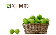
Orchard - Logo and Global Branding
Concept
Orchard's previous branding was very dated a little too traditional for today's market. They needed a clean, modern and eye catching brand with a clear bold statement.
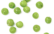
The association of the apples and their vibrant colour ensures brand recognition. The use of white space allows for endless possibilities when producing complementary printed materials or website artwork.
The association of apples with nature brings with it an indirect sense of trust and honesty; all good factors when potential customers are exposed to the brand.
Photography and logo artwork all done by Evil Monkey House.